Written by
JJoo
on
on
styled-component와 AntDesign 함께 사용하기
styled-component와 AntDesign 함께 사용하기
AntDesign 설치
npm install antd
기본 셋팅
전역으로 쓰일 AntDesign의 css(antd/dist/antd.css)는 styled-component로 만든 global-style.ts에 넣어줬다.
import { createGlobalStyle } from 'styled-components';
import { reset } from 'styled-reset';
import 'antd/dist/antd.css';

export const GlobalStyle = createGlobalStyle`
  ${reset}
  /* CSS 초기화 */
  ...
`;
styled-component로 오버라이딩해서 커스텀하기
AntDesign으로 레이아웃부터 작은 컴포넌트까지 모두 활용해서 사용해보려고 셋팅을 하다보니 css 커스텀이 필요했다.
일반 css로 설정을 하지 않고 AntDesign을 styled-component로 오버라이딩을 해서 사용해주면 쉽게 커스텀을 할 수 있다.
styled-component의 styled() 사용
import React from 'react';
// ant design
import { Layout } from 'antd';
const { Sider } = Layout;
// styled-component
import styled from 'styled-components';

function Siders() {
  return <SiderStyle style=>sider</SiderStyle>;
}
export default Siders;

const SiderStyle = styled(Sider)`
  background-color: #fff;
`;
Ant Design의 컬러 셋팅하기
설치
npm install @ant-design/colors
사용방법
import { } from '@ant-design/colors';
아래 문서 참고하여 원하는 컬러를 import 하면 된다.
Styled-component에서 Ant Design 컬러 적용하기
import React from 'react';
// ant design
import { Layout } from 'antd';
const { Sider } = Layout;
import { grey } from '@ant-design/colors';
// styled-component
import styled from 'styled-components';
function Siders() {
return <SiderStyle>sider</SiderStyle>;
}
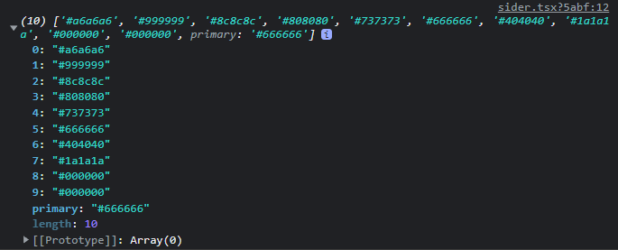
console.log(grey);
export default Siders;
const SiderStyle = styled(Sider)`
background-color: ${grey[1]};
`;
import { grey } from '@ant-design/colors';: color 팔레트(모음) 불러오기console.log(grey);: 콘솔로 찍어보면 해당 컬러 팔레트의 코드배열이 찍힌다.${grey[1]};: 거기서 원하는 컬러값 확인 후 적용
Discussion and feedback